These guidelines aim to optimise the consistency and quality of the visual aspects of the visual identities of Human Rights House Foundation and the Human Rights Houses. They provide guidance for the use of our visual assets and outline best practices.
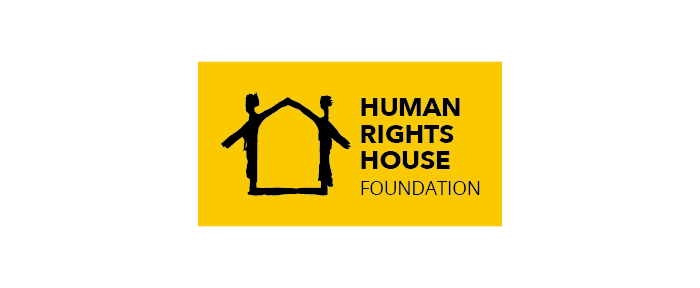
HRHF’s logo
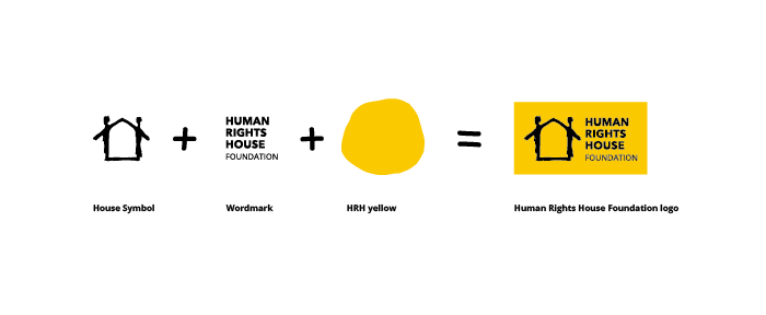
Designed in the 1990s by Norwegian artist Arne Nøst, the House symbol at a first glance tells a story of a sheltering structure with walls and a roof – a Human Rights House. A second look might also reveal the two human rights defenders that have united to form this structure by working together in harmony – they bring unity, community, and the human touch to the symbol.
“If you look at the logo, you can see a house with a grand roof. In my mind, this is the house for brave people fighting for rights in different countries. It is a house for democracy, and we are all one big family in this House for human rights.”
Malahat Nasibova, Resource Centre Nakhchivan
Human Rights House Foundation and the network of Human Rights Houses are very proud of this symbol and this concept. The House symbol is widely recognised, it is a common symbol of our network and reflects our work, values, and the Human Rights Houses which remain central to everything we do. This is why this symbol has remained largely unchanged for over two decades while the other elements of the logo have evolved over time to keep our branding fresh and up to date.
Variations
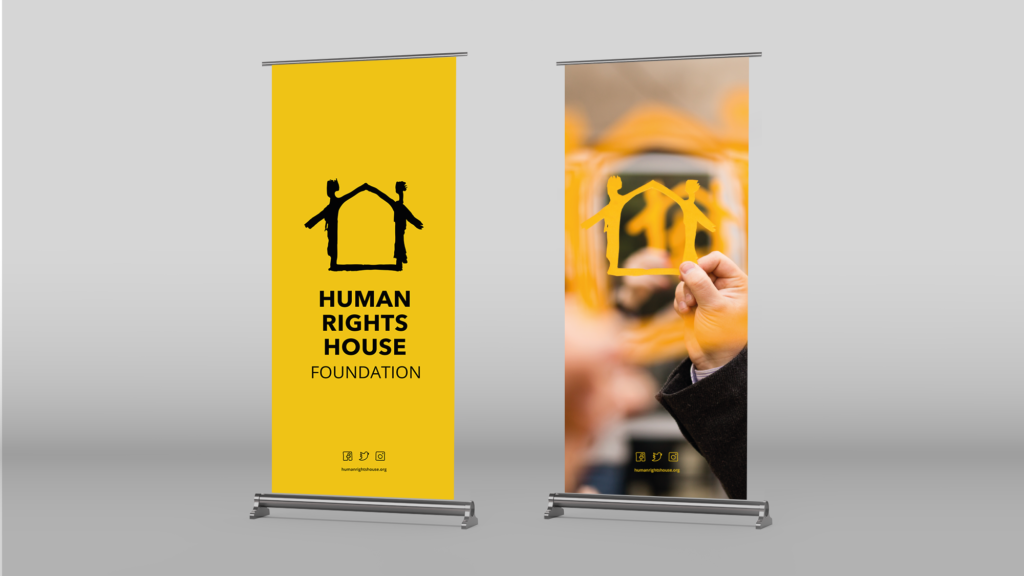
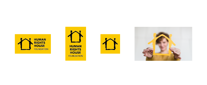
We have three logo styles: one representing the network of Human Rights Houses, the logo of Human Rights House Foundation, and the logos of the individual Human Rights Houses. The main horizontal logo above should be prioritised. However, we have developed a secondary, vertical logo to fit long materials such as rollups.
While the full-colour logos are preferred and should be prioritised, a black and white version of the logo can be used on products that will be printed without colour. For example, on some letters and on some envelopes.
Icon
The icon has been designed only for use in spaces that demand a 1:1 aspect ratio, such as a profile picture on social media, and website favicons.
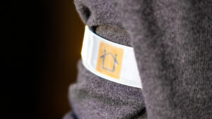
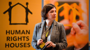
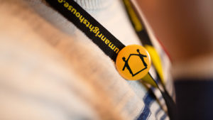
House Symbol
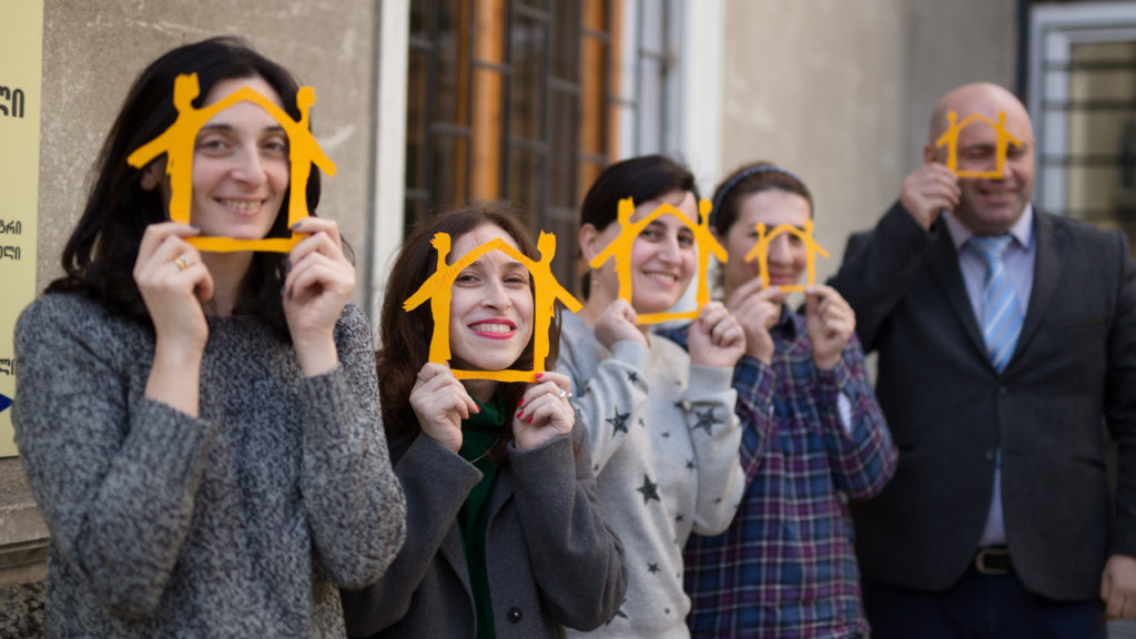
The House symbol should only exist by itself as a physical object, to be used in the real world. In this format, it can be used for example, at events, as a prop for photographs, as a decoration.
If the symbol is prepared by hand, for example, for use in a peaceful demonstration – the yellow should be as close to the warm brand yellow as possible. See more about the colours below.
Best practices
Our logos should only be reproduced from the master artwork and should not be redrawn or altered in any way. Contact communication@humanrightshouse.org if you have any questions.
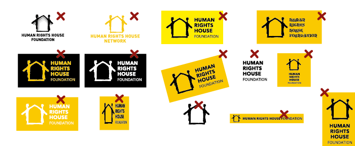
Things to avoid:
- Do not use old Human Rights House Foundation logos
- Do not use the old “Human Rights House Network”, instead use the Human Rights Houses logo
- Do not use off-brand colours, see more about colour use below
- Do not change fonts, see more about typography below
- Do not use black boxes
- Do not change the angle of the logo
- Do not use the wordmark by itself
- Do not fit the entire logo in a square
- Do not re-size without preserving the correct ratio
- Do not use the House symbol in black, do not use it outside of real-life settings
- Do not make the wordmark fit on one line
- Do not ignore the exclusion zone
Colours
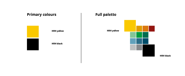 Our primary colours are HRH yellow and HRH black. The full palette also includes a secondary set of colours that can be used as accent colours in infographics, on humanrightshouse.org, and on other visual products.
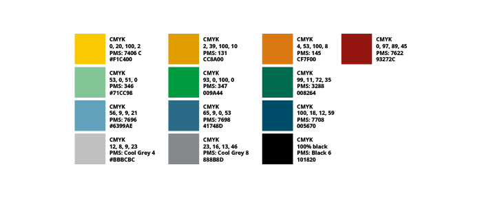
To ensure that the colours are represented as best as possible on screen and in print, please refer to the colour codes.
Typography
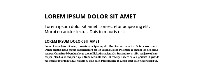
In our work, we use a set of design fonts, and system fonts for everyday use. Our design fonts are Open Sans and Crimson.
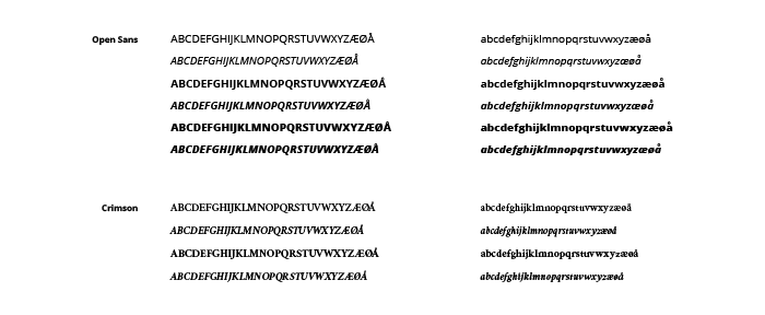
Open sans can be used for headings and other stand-out information. Crimson is used for long continuous text, such as the body text of reports.
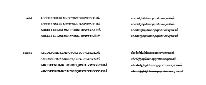
The installation of fonts is not universal across all computers. As such, we rely on system fonts when sending out information in “live” everyday documents, for example, word documents and powerpoints. In these cases, Arial replaces Open Sans, while Georgia replaces Crimson.
Practical application